


Responsive Platforms and Mobile Devices
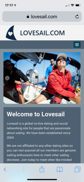
The Lovesail site has a responsive platform. This means that the software will adjust to the screen size of the device you are using to make it more user friendly. If you are using a mobile/cell phone the site will be arranged down the page. Some members think this is an APP, it is not. You are viewing the main site so you will need to log into the site for each session. Unlike an APP it will not keep you logged in once you leave your session.
If you are unfamiliar with the design on a mobile/cell phone take some time to familiarize yourself with the layout, it will render down the page. The menu bar can be found where you see 3 horizontal bars in a box (as per the image). Touch on the 3 bars and a drop down menu will appear and you will see Login (second from top). Touch on this and you will then see the login box. Once logged in you will then see two menu bars which contain links to the various pages of the site.
Thank you
Erica
- Jun 11, 2019
- 333 views